
Build from scratch
When your brand is distinctive, your product has unique interaction patterns, or you need complete control over accessibility and performance.
Every time your team creates a new button, chooses a color, or picks a font size without a system to reference, you're accumulating design debt. A design system isn't overhead - it's the infrastructure that makes your product faster to build, more consistent for users, and cheaper to maintain.
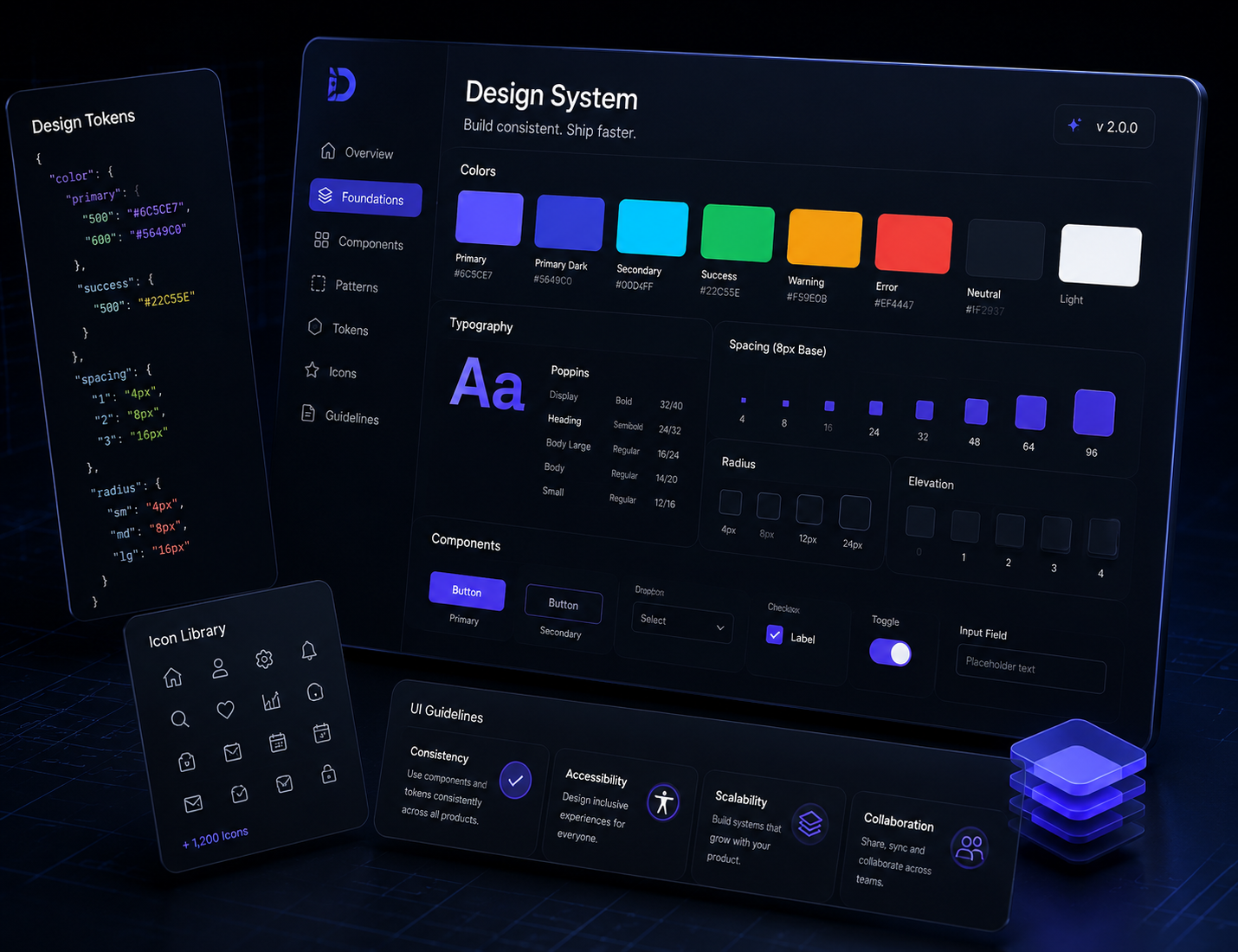
A design system creates a shared foundation for designers and engineers - making products faster to build, easier to maintain, and more consistent across every experience.
The atomic values that define your visual language - colors, typography, spacing, border radii, shadows, and motion. Stored as variables that propagate from design files into code.
Higher-level patterns built from components - forms, navigation patterns, empty states, loading states, error states. Solved problems that never need to be solved again.
Every reusable UI component documented in Figma - with all variants, states, and interaction behaviors. The single source of truth for designers.
Documentation for when and how to use each component - not just what it looks like. Includes dos/don'ts and accessibility requirements.
Matching React (or React Native, Vue, etc.) component library with TypeScript props, Storybook documentation, and automated visual regression testing. The single source of truth for engineers.
Whether you build from scratch or extend an existing library, the right approach depends on your product needs and long-term priorities.
When your brand is distinctive, your product has unique interaction patterns, or you need complete control over accessibility and performance.
(shadcn/ui, Radix UI, Material UI, Ant Design, Mantine) when speed is the priority and your brand can be expressed through tokens without component logic.
We've done both. The recommendation depends on your situation.
We provide the tools, documentation, and frameworks required to keep your design system effective over time.
Figma component library with all variants and states
React / React Native / Flutter component library
Storybook documentation
Design token files (CSS variables, Tailwind config, or native tokens)
Usage guidelines and pattern documentation
Contribution guide for your team
Governance process for system updates
We provide the processes and support needed to prevent drift between design and implementation.
Set up contribution processes so teams can submit new components while maintaining quality standards.
Run quarterly audits to identify drift between design and implementation.
Provide on-call support for design system questions and edge cases.
Empower your teams with reusable components, clear guidelines, and the infrastructure needed to ship efficiently.